

 Even the most ineffective, unattractive or simple of man-made objects have been designed in some way. The same is true for the Web: Even the most hideous of websites are created by someone who has consciously made decisions into its design. For web design professionals, it’s normal to put a lot of work into a design, using research, analysis and their expertise to form a design to delight and engage.
This process is not quick and while many of us spend hours crafting websites for clients, our own website goes wanting. It’s in this situation that the process of undesign is growing.
Undesign 101
I associate “undesign” with websites where the design and content is scaled back to the bare necessities, allowing for the quick implementation of a simple yet professional design.
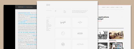
So far, only a small group of designers have adopted such an approach, so how undesign is defined in the future will inevitably change as more of us experiment with it. Looking at an undesigned website, it may appear to be an application of minimalism to its extreme. 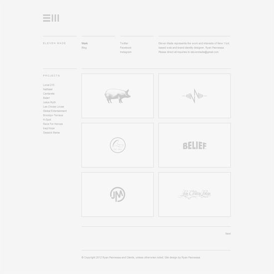 Eleven Made, portfolio of NYC-based web and brand identity designer Ryan Paonessa. Though an undesigned website can be identified by what you can (or can’t) see, it’s also about the process and the choices made by the designer that defines it.
Why Undesign?
Let’s discuss some of the pros of creating an undesigned site.
Easier to Create and Change
Designers typically redesign their website for one of two reasons. Firstly, their site no longer fulfills the objectives they wish it to.
Secondly, they wish to change the design because they’ve grown bored of it. No matter the reason, many full-time designers find it difficult to devote much time to changing the design of their website. To create a design and then deploy it is no quick task and, with so much else going on, it can be hard to find the time to speedily make the redesign happen.
By scaling back the complexity of the design, and the scale of the website as a whole, a once lengthy process can become much shorter, with the workload greatly reduced.
Easier to Make Responsive
Responsive design is still in its early days. This has, to a certain extent, made undesign a more desirable option as the rich interfaces we once created are even more complex to achieve when trying to make a responsive website.
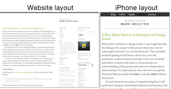 Mark Boulton’s website has a responsive layout. With responsive design seen as a must for any designer’s new website, the time that can be devoted to the design itself is further reduced and thus the design is more undesigned than it may have been without the addition of making it responsive.
When You Don’t Need to Show Off
For some designers, their work and reputation are so well known within the community that they don’t need an elaborate web design to impress potential clients. 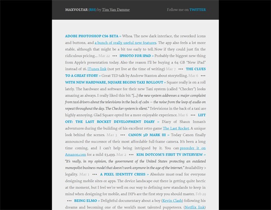 Max Voltar is the site of well-known designer Tim Van Damme. Some other reasons for going the undesign route are:
- You’re a full-time designer: A designer that works full-time for an agency may only need a site as a repository for thoughts and their personal work.
- You have a high volume of clients: A designer can be booked up with so much work that they are no longer actively looking to be hired by more clients. So their site, like a full-time designer, is not essential in gaining work.
- You have a strong portfolio: A designer may feel their portfolio is strong enough to speak for itself without the need to utilize their own site as an extension of their portfolio.
Undesign May Not Be Your Client’s Cup of Tea
The way you design your website can be viewed as an extension of your work portfolio, a way to show off your personality and skills. The design flourishes we add to our sites are the products which sit in the window showing, the type of designer we have become and the level of our skills. So why would you employ a stripped back design in your portfolio site if you want to display your design capabilities?
A professional is able to recognize a well-crafted, well-thought-out minimal design against something that’s just hastily put together. But for most clients, the distinction isn’t always obvious. Instead, a client viewing an undesigned website might see a website that may appear to contain no show of exceptional skill and a website that lacks personality and any element of uniqueness.
As a design style, undesign is not like the rest. Undesign will, at least for the time being, may only ever find a home on the website of a web professional. The reason undesign might not be suitable for client work is that it’s difficult to find a client open-minded enough to consider such a stripped-down design approach.
Undesign could find its way on personal websites, but non-designers are more likely to be attracted to more complex designs.
Examples of Undesigned Websites
For inspiration, here are some more examples of undesigned portfolio sites. Elliot Jay Stocks 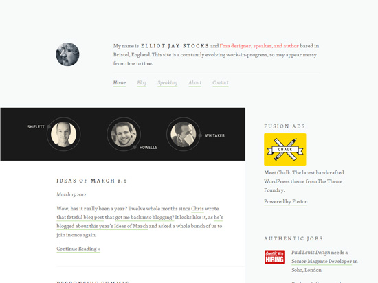 Nemeth Interactive
 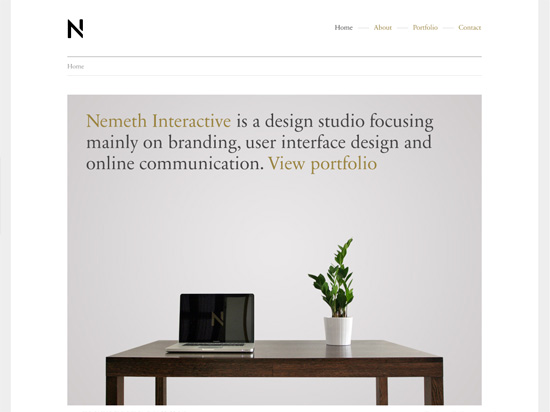 Andy Mangold
 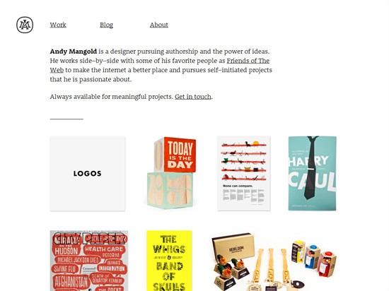 Stuff & Nonsense (Andy Clarke)
 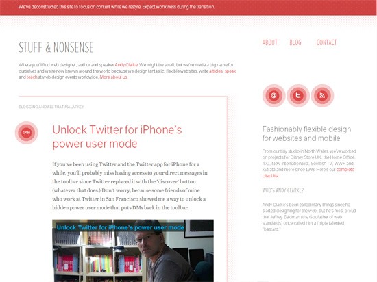 Socket Studios
  Claire Coullon
 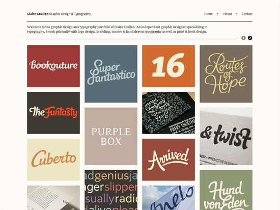 Manual
 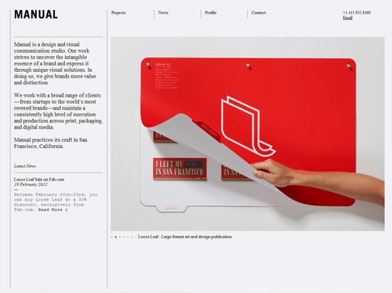 Drexler
 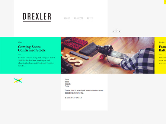 b14
b14  FO
FO 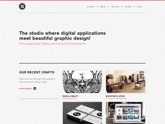 Undercurrent
 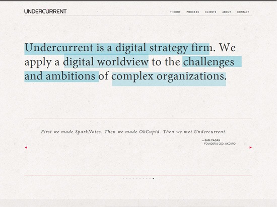 Studio AIRPORT
Just Another Trend?
The idea of undesign seems to be so new to the community that it could just become yet another trend that disappears in a year or two.
The fact that high-profile designers like Elliot Jay Stocks, Mark Boulton and Tim Van Damme have adopted such an approach for their own sites will most certainly lead to others considering the same approach for their website. A trend in web design is something that many designers grow quickly excited about but, by over-adoption or on questioning the reasons behind its use, soon falls out of favor. Think of the glossy “Web 2.0” look or faux coffee rings that came and went.
The reasons behind using these styles and effects in our designs, in many circumstances, were weak at best. Though time will inevitably dictate whether undesign sticks around for the long haul, I don’t think it can ever be considered as just a trend as I believe that it will always be a style that designers can adopt in situations where time is at a premium.
Related Content
-
 President of WebFX. Bill has over 25 years of experience in the Internet marketing industry specializing in SEO, UX, information architecture, marketing automation and more. William’s background in scientific computing and education from Shippensburg and MIT provided the foundation for MarketingCloudFX and other key research and development projects at WebFX.
 -

WebFX is a full-service marketing agency with 1,100+ client reviews and a 4.9-star rating on Clutch! Find out how our expert team and revenue-accelerating tech can drive results for you! Learn more
Make estimating web design costs easy
Website design costs can be tricky to nail down. Get an instant estimate for a custom web design with our free website design cost calculator!
Try Our Free Web Design Cost Calculator
Share this article


Web Design Calculator
Use our free tool to get a free, instant quote in under 60 seconds.
View Web Design CalculatorMake estimating web design costs easy
Website design costs can be tricky to nail down. Get an instant estimate for a custom web design with our free website design cost calculator!
Try Our Free Web Design Cost Calculator


