
The CSS box-shadow property can be used to give block elements a drop shadow or an inner shadow. Let’s take a close look at this CSS property.
Examples
Below are three different examples of applying the CSS box-shadow property on a div.
Example 1: Simple Drop Shadow
Here’s how you could give a div a subtle gray drop shadow.
box-shadow: 0 0 10px gray; 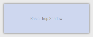
Example 2: Inner Shadow
An inner shadow can be rendered using the inset property value.
box-shadow: inset 0 0 10px; 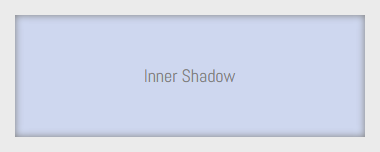
Example 3: Offset Drop Shadow
In this example, the box shadow is cast with a bias towards the bottom-right side of the box by using a horizontal offset and vertical offset of 5px.
box-shadow: 5px 5px 10px; 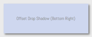 What if you wanted to have the shadow at the top-left portion of the box instead? We can do so using negative values for the horizontal offset and vertical offset. In the following example, the horizontal offset and vertical offset is set to -5px.
box-shadow: -5px -5px 10px; 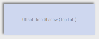 Now that you’ve seen a few examples of CSS
 box-shadow in action, let’s dig a little deeper.
Syntax
The general syntax of the box-shadow property is as follows:
box-shadow: [inset][horizontal offset][vertical offset][blur radius][spread distance][color];CSS Property Values
The CSS box-shadow property has six possible property values:
- inset
- horizontal offset
- vertical offset
- blur radius
- spread distance
- color
Only two property values are required: the horizontal offset and the vertical offset. Four property values, the horizontal offset, vertical offset, blur radius, and spread distance, must use a CSS length unit (e.g. px, em, %, etc.) The color value must be a CSS color unit such as a hex value (e.g.
#000000).
Property Value Summary
| Property value | Required? | Unit | Default value if not specified |
|---|---|---|---|
| inset | No | keyword | If inset is not specified, the box shadow will be outside of the HTML element. |
| horizontal offset | Yes | length | No default value. It must be specified. |
| vertical offset | Yes | length | No default value.
It must be specified. |
| blur radius | No | length | 0 |
| spread distance | No | length | 0 |
| color | No | color | Equal to the color property of the HTML element/s that the box shadow is being applied to. |
inset
If the inset keyword property value is present, the box shadow will be placed inside the HTML element.
box-shadow: inset 0 0 5px 5px olive; 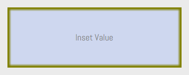 As a comparative reference, here’s the same box shadow without the inset property:
box-shadow: 0 0 5px 5px olive; 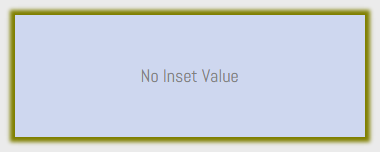
horizontal offset
The horizontal offset value controls the x-axis position of the box shadow. A positive value will shift the box shadow to the right, while a negative value will shift it to the left.
In the following example, the horizontal offset is set to 20px, or double the value of the vertical offset (which is set to 10px), so the shadow is two times wider horizontally.
box-shadow: 20px 10px; 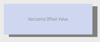
vertical offset
The vertical offset controls the box shadow’s position on the y-axis. A positive value will move it down while a negative value will move it up.
In the following example, the vertical offset has a length of -20px, or double the length of the horizontal offset (10px), so the size of the shadow is twice as big on the vertical axis. Also, since the value is negative, the location of the shadow is offset towards the top of the box.
box-shadow: 10px -20px; 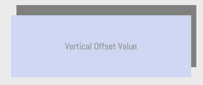
blur radius
The blur radius property value affects the blurriness/sharpness of the box shadow.
The blur radius is optional. If you don’t specify it, it will default to 0. Additionally, it can’t have a negative value, unlike horizontal offset and vertical offset. If the blur radius is 0, the box shadow will be sharp and its color will be solid. As you increase the value, it will become blurrier and more opaque.
In the example below, the blur radius value is set to 20px, thus the blurriness is quite pronounced.
box-shadow: 5px 5px 20px; 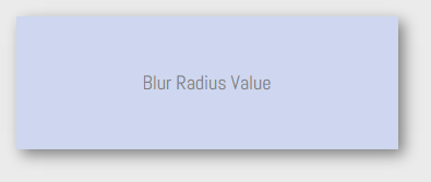
spread distance
The spread distance makes the box shadow larger or smaller in all directions. If it has a positive value, the box shadow will grow in size on all sides.
If it has a negative value, the box shadow will contract on all sides. Notice how, because of the positive spread distance (10px), there’s a 10px drop shadow on all sides of the box because there is no horizontal offset and vertical offset:
box-shadow: 0 0 10px 5px; 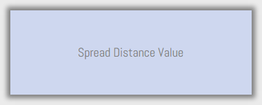 When the spread distance is negative, the shadow shrinks on all sides. In the following example, the shadow is smaller than the box’s width because of its negative spread distance and the absence of a horizontal offset:
box-shadow: 0 10px 10px -5px; 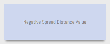
color
As you can already tell by its name, the color value sets the box shadow’s color.
It can be specified using any CSS color unit. Specifying a color value is optional. By default — in other words, if you don’t explicitly state a color value for your box shadow — the shadow’s color will be equal to the color value of the HTML element the box-shadow property is being applied to.
For instance, if you have a div that has the color of red, the box shadow’s color will also be red:
color: red; box-shadow: 0 0 10px 5px; 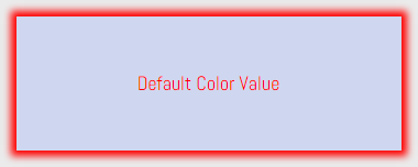 If you want a different shadow color, then you’ll need to specify it in the
 box-shadow property value declaration. Below you can see that even though the foreground color of the div is still red, the box shadow color is blue.
color: red; box-shadow: 0 0 10px 5px blue; 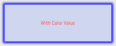
Multiple Box Shadows
This is where you can get really creative with this CSS property: You can apply more than one box shadow on an element.
The syntax is as follows:
box-shadow: [box shadow properties 1], [box shadow properties 2], [box shadow properties n];
In other words, you can have multiple box shadows by separating each property value group with commas (,). In the following example, there are two box shadows: A red one at the top-left side of the box, and a blue one at the bottom-right side.
box-shadow: -5px -5px 30px 5px red, 5px 5px 30px 5px blue; 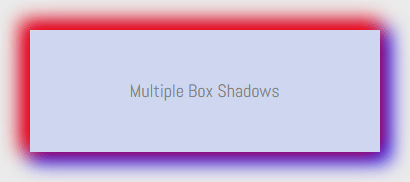
Browser Support
The CSS box-shadow property has good browser support.
Using Internet Explorer as the least common denominator, the property has been supported since IE 9 (which was released in 2011).
CSS Box Shadow Examples
You can see a live demo of all the box shadow examples used in this article by clicking the button below. View Demo 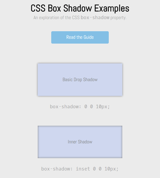
Related Content
-
 President of WebFX. Bill has over 25 years of experience in the Internet marketing industry specializing in SEO, UX, information architecture, marketing automation and more. William’s background in scientific computing and education from Shippensburg and MIT provided the foundation for MarketingCloudFX and other key research and development projects at WebFX.
 -

WebFX is a full-service marketing agency with 1,100+ client reviews and a 4.9-star rating on Clutch! Find out how our expert team and revenue-accelerating tech can drive results for you! Learn more
Make estimating web design costs easy
Website design costs can be tricky to nail down. Get an instant estimate for a custom web design with our free website design cost calculator!
Try Our Free Web Design Cost Calculator
Share this article


Web Design Calculator
Use our free tool to get a free, instant quote in under 60 seconds.
View Web Design CalculatorMake estimating web design costs easy
Website design costs can be tricky to nail down. Get an instant estimate for a custom web design with our free website design cost calculator!
Try Our Free Web Design Cost Calculator


