
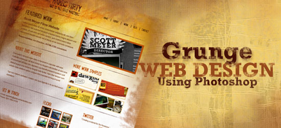
 In this step-by-step web design tutorial, you will learn how to craft a beautiful and eye-grabbing grunge-themed web layout using Photoshop. This tutorial is geared for beginners and intermediate-level Photoshop users. This is a two-part tutorial series that will show you how to create a grunge web design using Photoshop, with the second part as a follow-up web development tutorial providing you instructions on how to convert the design mockup to a fully-functioning web page using standards-based HTML and CSS. As a web designer, this will be a great skill to know.
Update: The second part of this tutorial series has been posted:
Final Result
Click on the following image to view the full-scale version of the design that we will be creating together in this Photoshop tutorial. 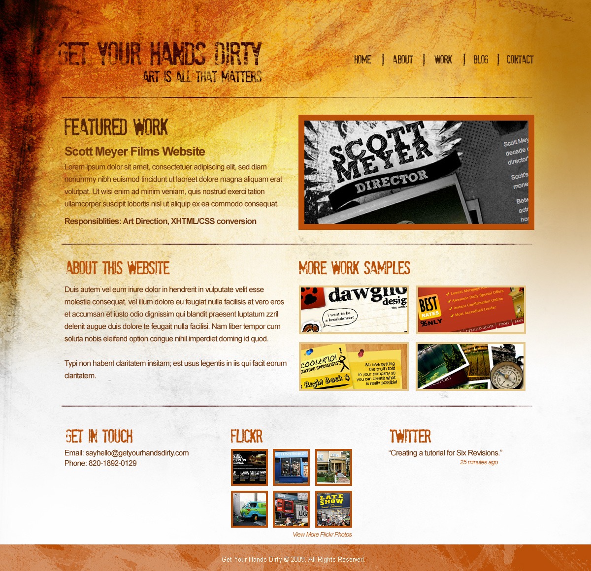
Setting Up the Photoshop Document
1 Create a new document in Photoshop with the dimensions 1200px x 1160px and with the document settings shown in the following figure. 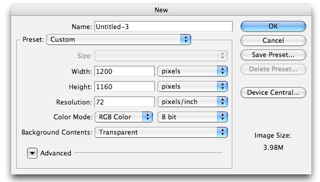
Creating the Layout’s Background
2 On the first layer, create our background using the Gradient Tool (G).
Make sure Linear Gradient is selected as the Gradient type. Set your Foreground color to #9D6000 and Background color to #FFFFFF.  3 We will add some texture to our gradient background.
Download the set of Light Grunge textures from Bittbox.com. These textures are free for both personal and commercial use but are not to be sold or redistributed in any way. We will use several textures from this set, so for convenience, keep the contents of the set handy throughout the tutorial.
Open the file called 3484741593_7575a6ebc7_b.jpg in Photoshop, File > Open… (Ctrl + O). Drag this texture onto our design and change this texture’s Blending Mode to Overlay.
Using the Transform Tool (CTRL + T), make this texture fit the size of the canvas by dragging the transform controls around the texture. 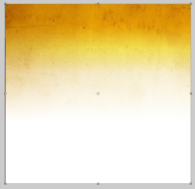 4 Using an ordinary feathered Eraser (E) with a 300px Master Diameter and its opacity set at 21%, erase the right side and far bottom areas of the texture. The following figure shows which areas we will be erasing (check the highlighted areas of the image).
We are doing this because the website we are about to create is meant to be left-aligned. By erasing in the manner specified, we need not worry about having to tile the textures seamlessly, we only need to tile the gradient background. 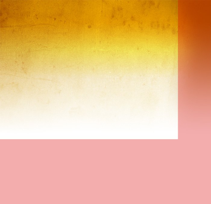 5 From the of Light Grunge textures set, open 3484744611_f995d6c67f_b.jpg in Photoshop and then drag it onto our canvas.
Using the Transform Tool (T), rotate it 90 degrees clockwise. Change this texture’s Blending Mode to Luminosity and the layer’s opacity to 39%. Repeat Step 4 for this texture, erasing parts of the layer with a soft featured eraser.
 6 Download the Ink Scribbles Brush Set from FudgeGraphics.com. These brushes are free for both personal and commercial use but are not to be sold or redistributed in any way. Activate the Brush Tool (B) and load this brush set by clicking the tiny arrow as shown on the image below.
![]() Once the brush panel shows up, click on the other tiny arrow and click on Load Brushes. Refer to the following figure below.
Once the brush panel shows up, click on the other tiny arrow and click on Load Brushes. Refer to the following figure below. 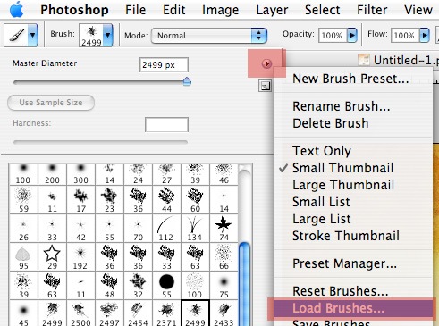 7 Create a new layer above the textures.
With the Foreground color set to #000000, use the 6th brush from the Ink Scribbles Brush Set we downloaded.  Click once on the upper left side of our canvas to apply the brush stroke. It is not necessary to show the entire brush.
Position it in such a way that only the bottom right part of the brush stroke will appear on the canvas.  Change this layer’s Blending Mode to Overlay and the layer opacity to 52%. We should now have something like the following figure.
 8 Repeat Step 7, but this time, use the 9th brush from the Ink Scribbles Brush Set.
  Set the Blending Mode of this layer to Overlay and decrease the opacity value down to 41%. We should now have something like the following figure.
 9 Create a new layer. We’ll use the 6th brush from Ink Scribbles Brush Set, but with a brush’s’ Master Diameter adjusted to 432px. Click in the upper left corner of the canvas to apply the brush stroke.
 10 Using the Smudge Tool with a Feathered Brush selected, smudge the layer by clicking and dragging your mouse on the canvas in a downward motion. Do this until you get something like the following figure.
  11 Change this layer’s Blending Mode to Overlay and its opacity to 35%.
Now you should have something like the following figure. 
Setting Up Photoshop Guides
12 We are now going to add the content. Make sure that our content is centered on the Photoshop canvas, not exceeding the 1000px in width.
To ensure that we keep our site content inside 1000px, use Photoshop Guides by dragging them from the Rulers on the left and top sides of Photoshop (refer to figure below). 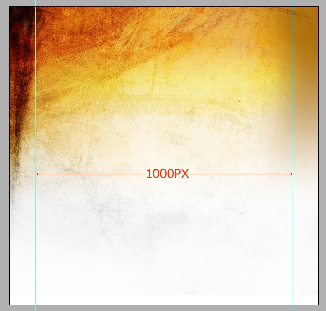
Making the Website Logo
13 Using the Horizontal Type Tool (T) with a color set to #3A0707, add the title to our mockup; this will serve as the site logo. Here, I used the font called Stam Pete from dafont.com.
This font is free for personal use only. If you want to use another grungy font, you can find a large collection of grunge fonts on the dafont.com. 
Making the Site’s Primary Navigation
14 On the right-hand side of the logo, add the navigation text using the same font and color.
 15 Add a division in between each navigational item. Using the Horizontal Type Tool (T) and the same font and color, type the letter “I” in between each navigation item, effectively creating vertical dividers in between them. Note: the font size of the divider must be increased in such a way that it is slightly bigger than our navigational items.
Duplicate the letter “I” 4 times and spread it across the navigation evenly. 
Making the “Featured Work” section
16 Below our title and navigation, we will add a “Featured Work” section. Add a photo or screen capture of your personal work (to serve as a thumbnail).
Add a description of the work on its left. The same font (Stam Pete) is used in the heading, and the rest of the copy is the web-safe font called Arial. 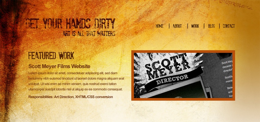 For the featured work thumbnail, add a stroke around it by right-clicking on the layer and selecting “Layer Styles…” on the context menu to open the Layer Styles dialog box (alternatively: double-clicking on the layer will also open the Layer Styles dialog box).
Use the settings below for the Stroke blending option. The color of the stroke is #BA5009. 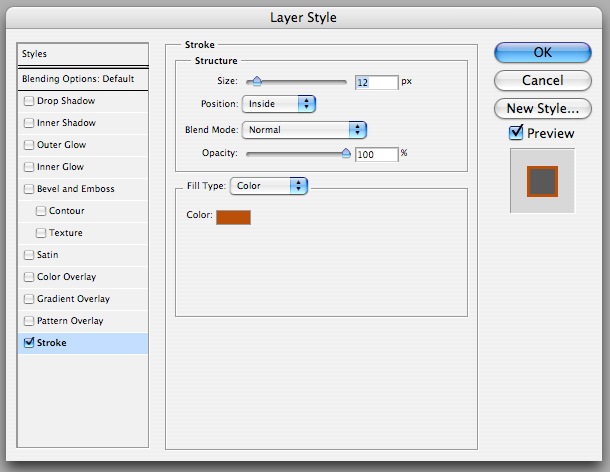
Making the “More Work Samples” Section
17 Now, we’ll add a “More Work Samples” section below the “Featured Work” thumbnail.
For the heading text, use the color #BA5009. 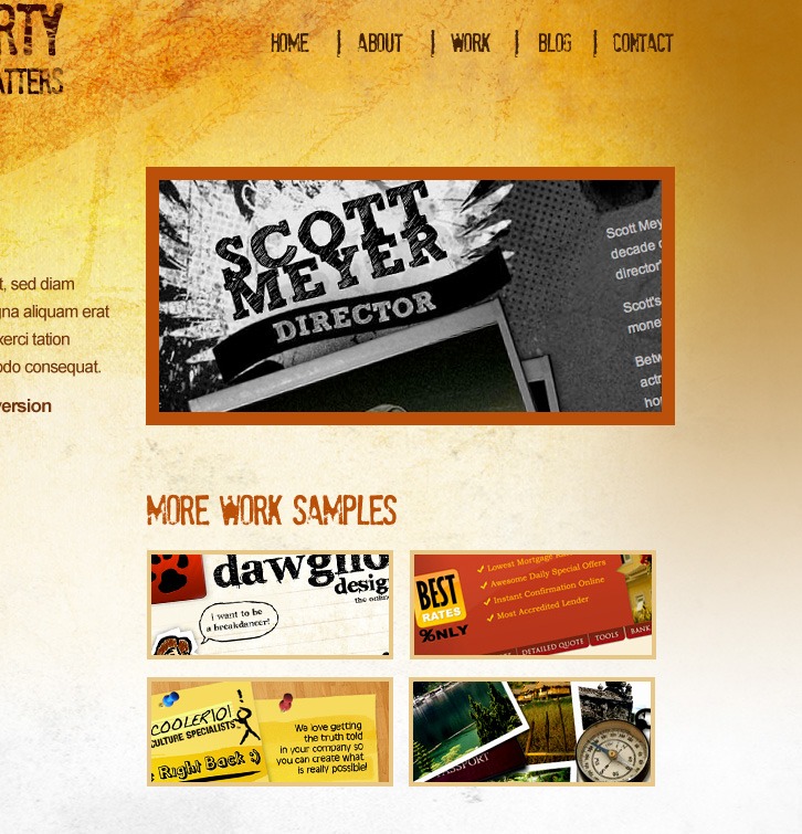 For the stroke around the thumbnails, follow the same instructions in Step 16. The color of the stroke is #E7C788.
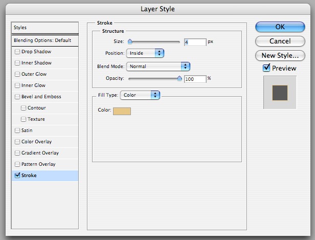
Designing the “About This Website” Section
18 On the opposite side of the “More Work Samples” section, add an “About This Website” section. Use the same font type, font size and font color that we used for the “More Work Samples” heading.
Use Arial for the rest of the copy. 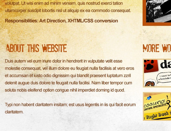
Designing the Secondary Content Section
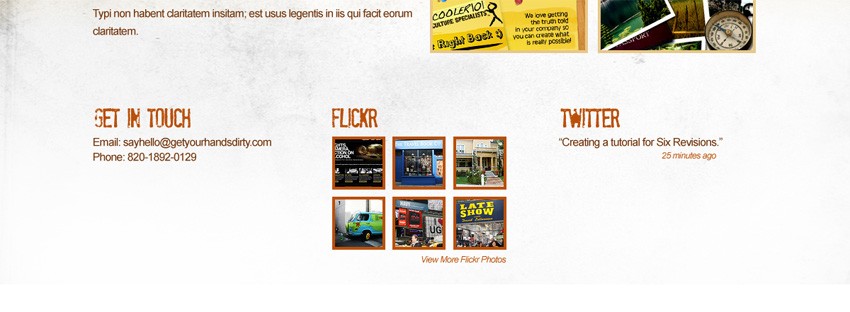
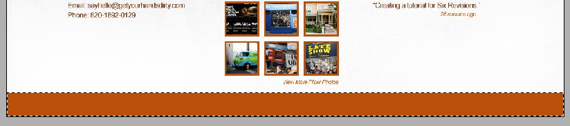
19 Below our “About This Website” and “More Work Samples” section, we’ll create three sections to accommodate “Get In Touch”, “Flickr” and “Twitter” sections. The same font type, font size, and font color from the previous step (Step 18) should be used.
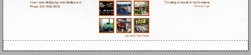
Making the Site Footer
20 Below the three sections we just created, create a selection using the Rectangular Marquee Tool (M). Using the Paint Bucket Tool (G), fill this selection with the color #BA5009. This filled-in selection will serve as the background for the site’s copyright information.
 21 Using the Eraser Tool (E), select any of the Ink Scribbles Brush Set brushes we downloaded and change its opacity to 21%.
 ![]() Erase some areas of the rectangle we just created in the previous step and then add the copyright text at the center of our document using the Horizontal Type Tool (T).
Erase some areas of the rectangle we just created in the previous step and then add the copyright text at the center of our document using the Horizontal Type Tool (T). 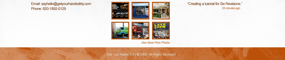 Make sure that when adding the copyright, Anti-Aliasing is turned on.
This ensures types in smaller sizes to be more crisp and readable. 
Making the Horizontal Dividers
22 Now, we’re going to add divisions to each of our section. Create a new layer.
Using the Pencil Tool (B) with a Master Diameter of 2px, draw a straight line across our canvas right to delineate the site header. Hold the Shift key when drawing the line to make sure that the drawn line will be straight.  23 Select the Eraser Tool (E).
Choose any brushes from the Ink Scribbles Brush Set and reduce its Master Diameter to 97px and opacity reduced to 40%. Slightly erase some of the areas to grunge up and distress the pencil line. 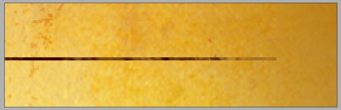 24 Duplicate the division layer twice by right-clicking on the layer and selecting “Duplicate Layer…” in the context menu.
Use the duplicated layers to separate each section; use the following figure as a reference. 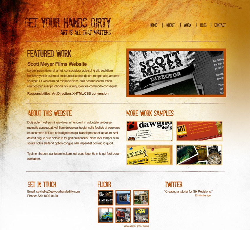
Finished!
Congratulations, we’re finished with our grunge web layout mockup! If you followed this step-by-step tutorial, you should come out with a web design mockup as shown below.
Obviously what you would do when you’re designing a college’s website, but it is great and unique for artists, bands, etc.
The “Grunge Web Design” Tutorial Series
This tutorial is the first part of a two-part tutorial series that shows you how to create a grunge web design in Photoshop, then how to code the grunge web design mockup into a standards-based (X)HTML template. The next post will be published next week and to make sure that you’re notified as soon as part two is published, you have to subscribe to the Six Revisions RSS feed.
- Part 1: How to Create a Grunge Web Design Using Photoshop
- Part 2: How to Code a Grunge Web Design from Scratch
Related content
- How to Create a Sleek and Textured Web Layout in Photoshop
- Related categories: Web Design
-
 President of WebFX. Bill has over 25 years of experience in the Internet marketing industry specializing in SEO, UX, information architecture, marketing automation and more. William’s background in scientific computing and education from Shippensburg and MIT provided the foundation for MarketingCloudFX and other key research and development projects at WebFX.
 -

WebFX is a full-service marketing agency with 1,100+ client reviews and a 4.9-star rating on Clutch! Find out how our expert team and revenue-accelerating tech can drive results for you! Learn more
Make estimating web design costs easy
Website design costs can be tricky to nail down. Get an instant estimate for a custom web design with our free website design cost calculator!
Try Our Free Web Design Cost Calculator
Share this article


Web Design Calculator
Use our free tool to get a free, instant quote in under 60 seconds.
View Web Design CalculatorMake estimating web design costs easy
Website design costs can be tricky to nail down. Get an instant estimate for a custom web design with our free website design cost calculator!
Try Our Free Web Design Cost Calculator


