
Testing your responsive web designs is crucial because the user experience on mobile devices is quite different from desktops. But actual testing on all the mobile devices in the market isn’t practical for most of us. So a simple responsive design testing technique some of us do is resizing our browser’s window size to kind of match the viewport sizes of smartphones and tablets.
This is a quick-and-dirty trick for basic visual testing and it helps us spot major problems, but it’s a terribly inaccurate portrayal of the mobile device experience. Mobile devices have unique touch interactions like swipes and pinch-to-zooms, and likewise, desktops have interactions like hovering and right-clicking. Responsive designs must account for these variances.
This tutorial will discuss an effective and practical method for debugging and testing your responsive designs. It involves a tool you probably already have: Google Chrome. Google Chrome’s DevTools has a feature called device mode that’s loaded with helpful tools for testing and debugging responsive designs.
Device mode is unprecedented. Most other responsive design testing tools simply resize your viewport, but device mode actually emulates the mobile device experience, particularly touchscreen interactions like tapping and swiping, right in your web browser. Here’s a rundown of device mode’s main features:
- Mobile device emulation: Device mode has accurate models for popular smartphones and tablets (e.g. iPhone, Galaxy, BlackBerry, Kindle, Nexus, and a ton more) that simulates how your responsive designs look and function on touchscreens. It even spoofs the UA string to match the particular device you’re testing so that you’re getting a very precise design preview of your work.
- Touch events emulation: This feature allows you to experience your designs as if you were interacting with them on your smartphone or tablet.
- Media queries inspector: This is a ridiculously useful feature that shows you all your media query breakpoints. Clicking on a breakpoint resizes your design’s preview, so you no longer have to manually resize your browser window.
- Mobile network simulation: mobile internet connectivity is different from our machine’s high-speed broadband connection. Also, many parts of the world still don’t have access to faster mobile internet technologies like LTE. Device mode can show you how your designs perform on EDGE, 3G, LTE, DSL, and WiFi to help you identify potential web performance problems.
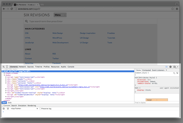
To start using device mode, open up your web design in Google Chrome. Then, open Developer Tools by clicking on Chrome’s menu and then choosing More tools > Developer Tools. The keyboard shortcut for opening Developer Tools is Ctrl+Shift+I (Win) or Option+Command+I (Mac). 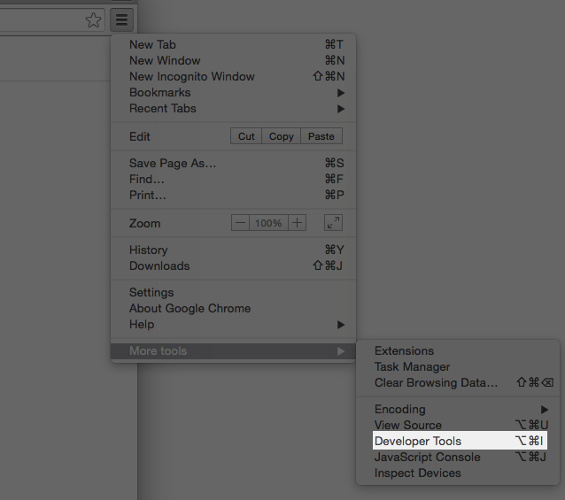 You should now see the Chrome Developer Tools (abbreviated as DevTools from now on) panel at the bottom or on the right of your browser’s viewport.
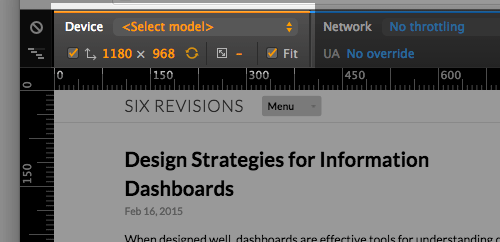
 Click on the device mode icon (it’s a super tiny button that looks like a smartphone) to toggle device mode on and off.
 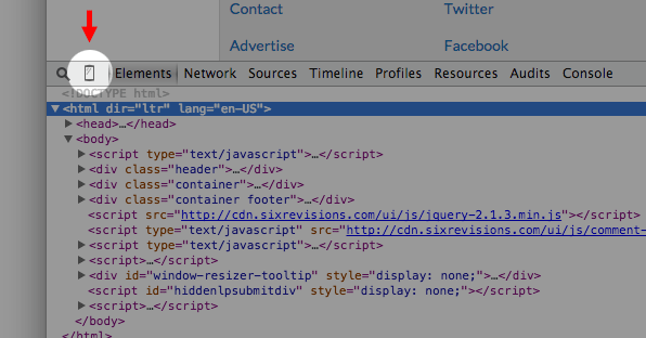 When device mode is turned on, you’ll see something along the lines of the image below, and the smartphone icon will turn blue:
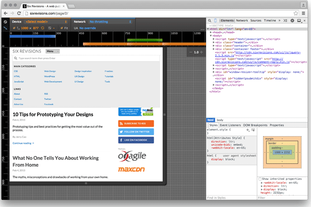
Responsive Design Testing on a Specific Mobile Device
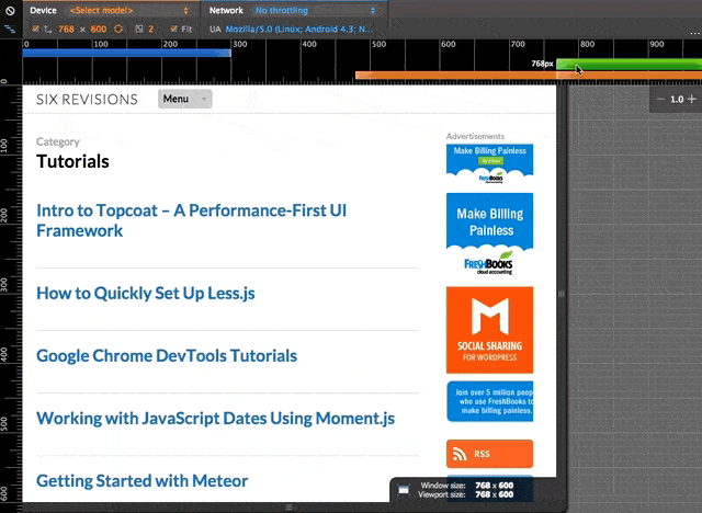
Use the Device panel to emulate the experience of a particular mobile device. This will allow you to visually test your design on said mobile device, as well as test touch-like interactions.
 Let’s say we’d like to see how our responsive design looks and functions on an iPhone 5. All we’ll need to do is select that device in the <Select model> dropdown list:
 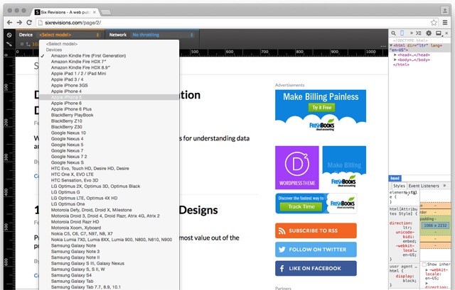 Device mode will change the design preview so that you’re seeing what an iPhone 5 user might see. What’s more, if you notice, your mouse cursor is now a circle. When you move your mouse up and down, the design preview will scroll up and down, simulating the swipe interaction behavior.
Moving your cursor over a link won’t act like you’re hovering over it (because there’s no hover on touchscreens). 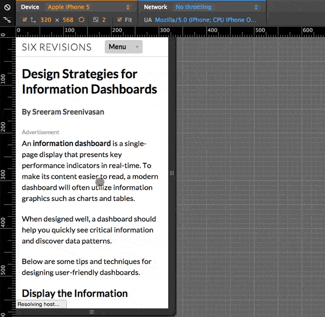
Media Queries Testing/Debugging
Debugging and testing your media query breakpoints is super easy when you’re using device mode. Just click on the the “waterfall” icon at the top-left of device mode and it will show you a bar graph of your breakpoints.
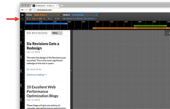 Also, hovering over the “waterfall” icon will display the number of media queries there are on the page you’re testing.
 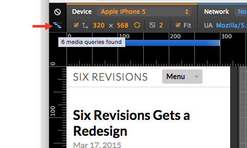 Clicking on the bars will immediately switch the design preview to that media query breakpoint. Switching back and forth between your media queries is quick, making this feature quite a huge time-saver.
 The colors of the media query bars are indicative of the type of media query being represented: Orange is a min-width media query, blue is a max-width media query, and green is a min and max range media query (e.g.
 @media (min-width: 320px) and (max-width: 640px)). Related article: Design-Based Media Queries
Mobile Internet Testing
You can test the perceived performance of your responsive design by using the Network feature of device mode.
Click the Network dropdown menu and choose the mobile network technology you want to test with, such as EDGE or 3G. This feature will throttle your Internet connection to match your chosen network technology. 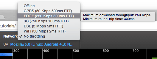
Conclusion
DevTools is an incredibly powerful tool, and device mode makes it an even more indispensable part of the modern web designer’s toolkit.
There are a few more features in the device mode for you to explore, such as:
- Changing the
devicePixelRatioin the Device panel for testing the UX on Retina displays - Vertical/horizontal rulers on the top and left of the viewport to help you eyeball certain pixel lengths
- Manual override of the UA string (the text field at the bottom of the Network panel)
Share your strategies for responsive design testing in the comments below. Do you have tips to share about device mode?
Related Content
- Understanding the Elements of Responsive Web Design
- Creating Responsive Images with CSS
- Responsive Full Background Image Using CSS
- A Comparison of Methods for Building Mobile-Optimized Websites
- Responsive Web Design is Not the Future

-
 President of WebFX. Bill has over 25 years of experience in the Internet marketing industry specializing in SEO, UX, information architecture, marketing automation and more. William’s background in scientific computing and education from Shippensburg and MIT provided the foundation for MarketingCloudFX and other key research and development projects at WebFX.
 -

WebFX is a full-service marketing agency with 1,100+ client reviews and a 4.9-star rating on Clutch! Find out how our expert team and revenue-accelerating tech can drive results for you! Learn more
Make estimating web design costs easy
Website design costs can be tricky to nail down. Get an instant estimate for a custom web design with our free website design cost calculator!
Try Our Free Web Design Cost Calculator
Share this article


Web Design Calculator
Use our free tool to get a free, instant quote in under 60 seconds.
View Web Design CalculatorMake estimating web design costs easy
Website design costs can be tricky to nail down. Get an instant estimate for a custom web design with our free website design cost calculator!
Try Our Free Web Design Cost Calculator


