

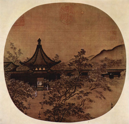
 Web designers, like other artists and craftsmen, impose structure on the environment. We enforce order and beauty on the formless void that is our blank computer screen. We do it in different ways — creating an organized layout first, writing text and content first, or even basing a design concept on an image, a color palette, or something that visually trips your trigger, whether it’s a sunset or a Song Dynasty painting.

 Wherever you gain your inspiration, it’s often not just the particular element that sparks your artistic impulse; it’s the totality of the element and its surroundings. Grasping that totality concept — both the individual element and the whole in which it exists are important both separately and together — is essential to understanding how gestaltism influences our design choices. We’ll cover 6 principles related to gestalt, in the context of design, and they are:
- Proximity
- Similarity
- Prägnanz (Figure-Ground)
- Symmetry
- “Common Fate”
- Closure
Gestaltism: A Matter of Perception
I think it’s imperative that we should use psychological techniques more in our designs. I’m not saying design should be completely scientific or mathematical, but I do believe the best design comes when proven theory works in harmony with art. The idea of the “gestalt” is a fairly old one, originating with early 20th century philosopher Christian von Ehrenfels along with his contemporary, psychiatrist Max Wertheimer, among others.
At its simplest, gestalt theory describes how the mind organizes visual data. The stronger the clarity of form, the more effective the design. Let’s start with an illustration. This is called the “subjective triangle.” What do you see when you look at the figure below?
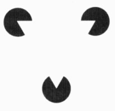 Source: Dr. Russ Dewey. If you said “a hamburger,” go get some lunch and come back.
If you said “three Pac Man-looking things chomping on a triangle,” then you’re on target. Except where’s the triangle? The triangle is implied.
It isn’t there, except as whitespace. But look at it and tell me the triangle isn’t there. Yes, it is.
One of the bright minds of gestaltism, Kurt Koffka, made the famous statement, “The whole is other than the sum of its parts.” His statement is often mistranslated as the much more familiar “The whole is greater than the sum of the parts.” Mr. Koffka didn’t like that translation, and pointed out that in his statement, he means the whole exists independently from the component parts. The famous “Dog Picture,” shown below, illustrates a Dalmatian dog sniffing under a stand of trees.
When you squint at it for a moment, you see the dog “come together” from the disparate black and white blobs of the picture. 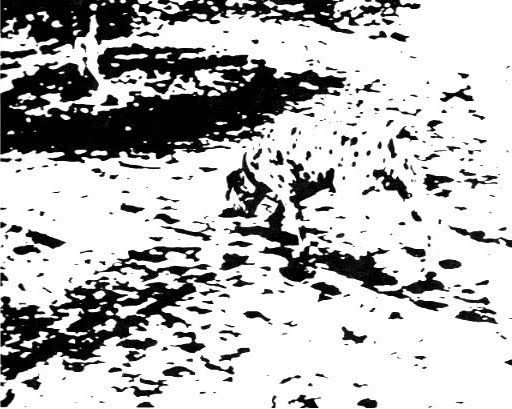 Source: José Pedro Gomes. You don’t say, “Oh, I see the feet, and the legs, and the head, and the trees, and okay, now I see the entire picture.” You look at it for a moment and say, “I see it, a spotted dog sniffing the ground near some trees.” You went from the initial “What the heck?” straight to “Ah a spotted dog under trees” — no stopping to list items and deduce from that list that you must be looking at a dog sniffing the ground near some trees. This is an illustration of the concept of totality — you grasp the “totality” of something before worrying about the details.
As Interactive Telecommunications professor Clay Shirky puts it, “you cannot understand all of the properties of water from studying its constituent atoms in isolation.” So “the whole is greater than the sum of the parts” misstatement is wrong. The whole is not greater than the sum of its parts. We’ve seen this concept dozens of times with beautifully executed websites that have one glaring flaw — a poor graphical or typographical choice, bad use of spacing, a dysfunctional chunk of JavaScript, a dropped bracket in the CSS file that renders the whole thing less than what it should be, sometimes to the point of non-functionality.
The whole is different than the sum of its parts; not greater, not less than, just different. We’ve seen this time and again as well, with sites constructed with simple design choices that work harmoniously and beautifully together. The whole is important.
The parts of the whole are important. The whole as it is comprised of its parts is important, and separate from the other two. Let me stop before I start sounding like Yoda.
Proximity
The concept underlying the concept of proximity is grouping. When we have a group of objects, we tend to see them as forming a group.
Proximity in Site Navigation
One basic concept of grouping in web design is with navigational links, where not only do we keep the navigation links together, but also group them internally, putting links to similar pages together, categorizing them into sub-categories, and so on. The example below is from the site of a Lake Tahoe ski resort.
Like most dropdown menus, it’s fairly simple at first glance, consisting of a single row of seven primary navigation link items (four are shown in the screenshot). 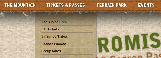 Site source: Alpine Meadows. Hovering over a primary navigation link item reveals more sub-navigation links. When a user hovers over or clicks on one of the primary navigation link items and sees that it reveals a dropdown sub-navigation menu, he’ll expect the same thing to happen with the next item.
They look the same and they’re grouped together — they should act the same way. And if we’ve done our job, they will. Nothing new here, I know, but it’s something we use frequently, and we didn’t need to know about proximity to pull it off.
But now perhaps we know more about why this design pattern works so well.
Proximity in Grouping Images
The 2002 Europe Music Awards site illustrates a different use of grouping. The MTV and Europe Music Awards logos form a separate group in the top left corner, while the logos of the sponsors form a group in the bottom right corner.
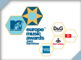 Source: Mads Soegaar. The white space helps form the two groups, as do the two blue triangles in the corners. Note that the triangles are not present in the “unoccupied” corners, thus they reinforce the notion of the two groups. Also note that the two organizational logos are larger and positioned top-left, thereby increasing their importance in relation to the cluster of smaller logos to the bottom-right.
The two clusters of logos not only form groups for design purposes, but for semantic purposes.
Proximity in Web Forms
The next example is of a fairly straightforward Web form from Yahoo!. Notice how the form is grouped into three segments: personal information, ID generation, and alternate ID provision.
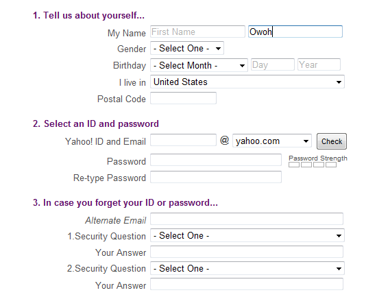 The form implies that first set of fields is the most important and the third is the the least important. They are grouped by headings (themselves ordered by number and set apart by color), and the fields themselves are arranged vertically, with the left sides of the field aligned with one another. All of this reinforces the relationships of the of three groups of information, sorted by importance.
Proximity is used to indicate grouping and importance.
Proximity in Icons
Another aspect of proximity is the propensity to perceive items arranged on a line or curve to be related to one another. Web designer Stu Nicholls created a nifty (albeit non-traditional) circular menu in 2008. ![[[ Source: Stu Nicholls. ]]](https://www.webfx.com/wp-content/uploads/2021/10/18-08_nicholls.jpg) Source: Stu Nicholls. Because of the circle that all eight icons sit on, and because of the light gray circles that compose the “background” of the menu, the icons are perceived to be part of a similar group. It also helps that the icons are thematically similar — with similar colors, sizes, and styles.
Source: Stu Nicholls. Because of the circle that all eight icons sit on, and because of the light gray circles that compose the “background” of the menu, the icons are perceived to be part of a similar group. It also helps that the icons are thematically similar — with similar colors, sizes, and styles.
In Nicholls’s live menu, hovering over an icon brings up a menu description inside the inner circle. Are you grouping things correctly? Are you using proximity to help imply importance and relationships?
Similarity
We’ve already seen this illustrated above — an example of parts of a whole (totality) working together to achieve a specific goal.
We group things perceptually if they appear similar to one another. This is also why so many designers prefer to use blue, underlined links, or at least have all the links appear distinct and the same as each other. Similar appearance equates to similar function.
In the screenshot of the Opera browser’s old Preferences dialog window, the menu items are grouped by color. 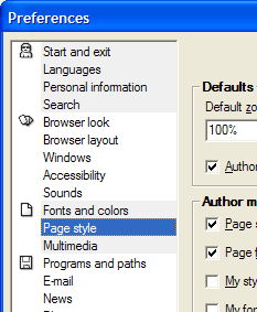 Source: Mads Soegaard. The gray background of the first four menu items group them together, and also sets them apart from the other items. They are also highlighted by the icons that sit beside the first item in each group.
Inadvertent Dissimilarity
Like everything in life, incorrectly applying the similarity principle can cause unwanted effects. During the 2008 US presidential campaign, People Magazine ran a cover photo of the McCain family, with then presidential candidate John McCain in the center. 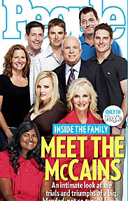 Source: Melissa McEwan. The McCains’ adopted daughter Bridget, a young woman from Bangladesh, was apparently “shoved into the corner,” occupying the bottom left corner of the magazine cover.
Combined with the effect of the top line of the cover text — which, if extended to the left, essentially “cuts” Bridget out of the picture — the photo gave some observers the idea that the McCains (or rather, the McCain campaign) were trying to “segregate” Bridget from the rest of the far more homogeneous family group. One blogger, Melissa McEwan, noted that at the store she visits, the plastic holders that contain the magazines on the store displays blocked Bridget from view by potential buyers. Truth be told, I’m no fan of John McCain, but I have no reason to believe that he does anything else except love and support his daughter.
The effect of the arrangement went unrealized, I’m sure, by McCain and the family members (who were on the other side of the camera and unable to see the effect of the arrangement until too late). But because of the compositional choice of the photographer, art director, and the various editors involved in designing the cover, the image gave viewers the idea that the McCains were trying to hide the only member of their family that looked dissimilar physically, and caused John McCain, Bridget McCain, and the other family members some unasked-for grief. McEwan wrote of People, “It doesn’t matter whether they intended to diminish Bridget on their cover, or merely failed to consider what message that would send.
Either way, it’s a mess.” And a mess that an understanding of similarity could have prevented. What elements of your designs are you unintentionally over- or under-emphasizing as a result of a misuse of the principle of similarity?
Prägnanz (Figure-Ground)
Our perception of the figure-ground relationship allows us to organize what we see by how each object relates to others. — Andy Rutledge
The “figure-ground” principle has to do with objects portrayed against a background.
There’s a reason why design gurus started telling us sometime in 1998 to stop using busy tiled graphics for our backgrounds — because they took away from the foreground objects. This is Design 101. Foreground objects should be more prominent than their backgrounds. There’s more to the figure-ground principle than just using appropriately unobtrusive backgrounds. The contrast and the visual tension between the figure (foreground object) and the ground (background) makes for interesting graphics and logos.
Examples of the “Figure-Ground” Principle
Take, for example, the old Visit Norway logo shown below.  Source: Mads Soegaard. The designers made use of both the foreground and background, creating three irregularly shaped objects (ocean waves, a tree branch, and a lump in a bird’s stomach — okay, I won’t swear to that last one) that combine to form the outline of a person with his or her arms outstretched. Don’t see it?
Think of the triangle illustrated above, and look again. If you still don’t see it, then you must have had the same trouble with those “magic eye” illustrations that I did; those things are all about figure-ground, as are many optical illusions. Or you can just find the two people in the Hope for African Children Initiative logo below.
Hint: a child is looking up at a woman, presumably his mother. (That’s why Namibia seems to have grown some real estate on its western coastline.)  Linux users will quickly recognize the old Gnome Desktop Environment logo.
 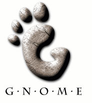 It’s a “G”, yes indeed, but it’s also a footprint.
And Macintosh fans know that the Mac logo shows not just a happy face — but a happy face in profile, presumably looking with delight into their computer screen. 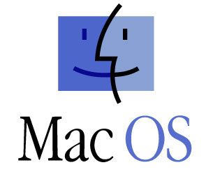 On the other end, we can see how the figure-ground principle is horrendously violated in this horse-training site. Usually I don’t hold up examples of sites doing things wrong, but since Vincent Flanders and “Web Pages That Suck” outed this site some time back, and the site proprietors left the problematic design in place anyway, I feel no compunction to show restraint here.
For those of you who sensibly hesitate to click the link, the site designer uses an animated background image of a lightning strike that’s tiled all over the page. Eeek!  It doesn’t take a sophisticated web designer to know that putting an obtrusive, visually aggressive image like that as your background takes away from your foreground objects.
Either those objects get lost in the background — which pretty much defeats the purpose of having anything in the foreground — or the foreground objects have to “shout” to be “heard” over the background “noise” usually by being very large and brightly colored to overcome the attempt of the background to dominate the design. In two years of teaching web design and construction to middle- and high-school students, this is the biggest single challenge I’ve had; “weaning” them off of using extremely “loud” and obtrusive background designs. Many of them would love that lightning strike, almost as much as they love those “background” images of Waka Flocka Flame.
I kid you not. I blame MySpace. Rutledge points out that rounded buttons with gradient or other non-solid color backgrounds can be important in establishing them as calls to action.
Here’s Jacob Gube’s slick and clean call-to-action button as an example.  The rounded corners, borders, gradient color scheme, and resulting illusion of 3D “depth” set the button apart from its surroundings, inviting the user to perceive as something apart from the background and makes it easily identifiable as something that can be activated. Lose the rounded corners, the borders, and especially the gradient color, and the button loses something of what makes it stand out from the background
Some of the most visually stimulating designs I’ve seen recently actually blur the lines between figure and ground elements, even interweaving the two.
This is a classic example of understanding the intricacies of a rule; essentially once you have understood the rule completely you have a license to break it. — in.house.media
Are your foreground objects working with your backgrounds to create a lovely, harmonious whole? Are your foregrounds fighting for the users’ attention? Are the backgrounds serving as an aesthetically and functionally workable backdrop to contain and set off your foreground elements?
Symmetry
Basically, the principle of symmetry tells us that when we look at certain objects, we see them as symmetrical shapes that form around their center. You don’t have to get into advanced design to know that humans like symmetry, and find it aesthetically appealing. When your designs are asymmetrically, you know you’d better have a good reason for making your design “askew.” Symmetry occurs in nature, in math, in molecules, in everywhere.
Usually, symmetry to the average viewer means an object that is made up of two complementary halves. What designers sometimes fail to realize is that when a viewer sees two unconnected elements that are symmetrical, they subconsciously integrate them into a coherent whole. Finland’s CSC (the nation’s Center for Science and Technology) has a very simple logo that illustrates the idea of symmetry in design.
 Though the logo sports two separate elements pointing in different directions and having different colors, the logo is easily viewed as a single entity because of symmetry. Unlike most graphics and designs that deliberately employ symmetry in their design aesthetic (and that’s pretty much all of them — even the most grungy and off-kilter sites are aware of the principle; if only to use it minimally to contrast against all the asymmetry in their work), this one is almost perfectly reflective in its two elements. The only real difference is in the colors used.
Most designers use at least a trace amount of asymmetry to give their designs some character. Some use considerably more, to dramatic and beautiful effect.
Pepsi’s Famous Mid-2000s Logo
No longer in use in the US, the old Pepsi logo is an excellent example of near-perfect symmetry.
Aside from the artistically “randomized” ice crystals, the logo is perfectly symmetrical both horizontally and vertically, with a wavy “axis” dividing the upper and lower halves. 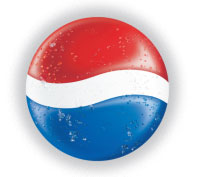 Even the 3D airbrush “light and shadow” effect is almost perfectly symmetrical, varying just enough to give the image a realistic appearance of depth. The “ice” and the airbrushing are excellent examples of how “pops” of asymmetry liven up a largely symmetrical design.
Pepsi’s Asymmetrical Redesign
Pepsi redesigned its logo in 2008, using a variant on the old logo (itself a variant on an even earlier one) that some felt diverged too strongly from the symmetry of the earlier offering, with the tilted, variable-width axis and the red area far larger than the blue. 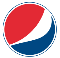 How do you feel about the newer design?
Symmetrical = Successful?
Bizcovering did a feature on ten symmetrical (and successful) corporate logos in 2007. The article poses the question, “All are symmetrical, perhaps this has something to do with their effectiveness?” What do you think?
Asymmetry in Ransom Note Design
A more extreme example of asymmetry is the classic “ransom note,” which traditionally is made up from letters cut out of magazines, pasted onto a sheet of paper, and delivered to the victim during a thunderstorm with ominous music playing in the background. The whole thing stands for disorganization and a likelihood that the perpetrator isn’t concerned about delivering Aunt Gertrude home safe and sound.
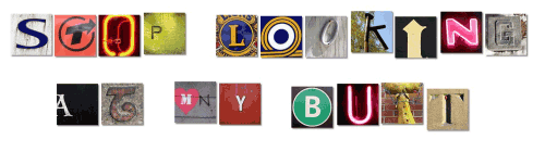 Image generated by the Ransom Note Generator. Notice anything symmetrical about the lettering? Most of them line up quite nicely, which is unusual for mad kidnappers with no sense of balance and form. I think the folks at Ransom Note Generator let their inner designer impose some unwarranted symmetry in their work.
Part of the reason why the ransom note is considered “scary” is because of its random, chaotic nature; asymmetry means action and the wildly asymmetrical nature of the letters implies action escalating into violence. How’s the balance between symmetry and asymmetry on your sites?
“Common Fate”
I think I watch too many crime shows on television, because the first time I came across this concept, an image popped into my mind of some hardboiled New York cop slamming his fist down on a table and yelling, “If you don’t roll on your brother, you’re gonna suffer the same fate he does! Is that what you want, both of you doing twenty up in Attica?
Sharing a common fate?!?” If the idea unnerves you, then you probably watch the same shows I do, and you shouldn’t worry, you won’t go to jail by employing the principle of “common fate.” The idea of “common fate” is simple: We perceive items or objects moving (or appearing to move) in the same direction as related to each other, more so than elements that are stationary or appear to be moving in different directions. Those related items are sharing a “common fate.” The cars in the photo below form two “streams,” the left “stream” moving from top to bottom of the image (essentially “toward” the viewer) and the right “stream” moving from bottom to top, “away” from the viewer. 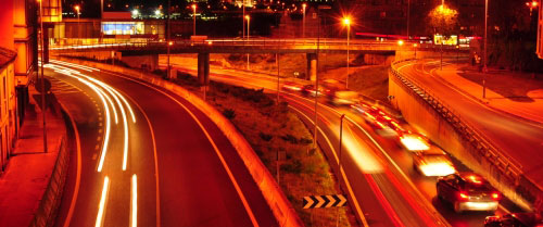 Source: stock.xchng Although this is an entirely static image, movement is implied, and relationships immediately form.
In our designs, elements that “move” with one another relate to one another, while elements that resist that common movement or move in a different direction, do not relate. This is a powerful, primal sensory cue among humans. Just think of the drivers’ reactions when a car comes down the lane in the opposite direction from everyone else.
Consternation and chaos ensue within moments.
Common Fate in Dropdown Menus
Drop-down and sliding menus such as the one from RedBrick Health shown below — especially the ones that “slide” as opposed to just appearing in the blink of an eye — appeal to the “common fate” principle. This main menu item has a slide-out sub-menu, so do the others.
therefore the two items are related in our minds. 
Common Fate in Tooltips
Tooltips also form an important informational relationship. If your tooltips always contain secondary but pertinent information, it won’t take long for a site user to put together — subconsciously — the relationship between moving/hovering the cursor and bringing up new information.
As Rutledge notes, “[p]ointer-plus-information all moving together is a useful association.”
Counter-Example of Common Fate
This doesn’t just apply to moving elements, but also the orientation of designs. In my earlier days, I designed a site with two background color gradients inadvertently “fighting” with one another. The header gradient went from light to dark, left to right; the navigation bar immediately underneath went from light to dark, top to bottom.
Individually, they worked well enough, but together, they clashed. The horizontal “movement” of the header gradient didn’t go well with the vertical “movement” of the bottom gradient.  The “movement” of the two gradients flow against one another.
The effect violates feng shui and “common fate” both. Are there design elements in your work that fight instead of flow together?
Closure
Closure means that we “close” objects that are themselves not complete; not only completing the figure in our perception, but perceiving the figure as having an extra element of aesthetic design; we look for a simple, recognizable pattern. Take a look at the old IBM logo.  You recognize the letters as an I, a B, and an M, no problem there.
But they aren’t letters at all; the whole thing is a compilation of bright blue horizontal lines arranged to create the perception of a set of letters. Does it put you in mind of the old ASCII art that was so popular during the 70s and 80s? It does me.
Here’s a 1975 rendition of a Spanish conquistador, created by using punched cards and reprinted in a 1978 Dominican newspaper: 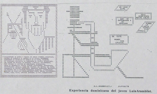 Source: Wikipedia. One of my favorite examples of closure is depicted on the cover of Paul Thagard’s book called Coherence in Thought and Action.
 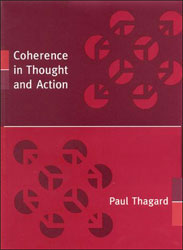 It’s a nifty three-dimensional cube hiding in among the “spotlights” of lighter red. They are, in reality, 24 dissimilar red shapes on a darker red background.
Our perception fills in the blanks. Another example hit the newspapers in the late 1990s, when the “Face on Mars” stirred the public imagination. Some people were put in mind of the monolith of 2001: A Space Odyssey, wondering if aliens hadn’t left us some cyclopean artifact for our use if we could just find a way to get to it, while others thought about War of the Worlds and stockpiled their bunkers with ammunition and MREs.
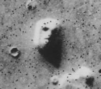 Source: Wikipedia. A closer look proved the “Face” was just a landform. Guess we didn’t need all those MREs after all.
Pulling It Together
This article is just a quick look at the principles of gestalt as they apply to design.
There is far, far more to the topic than can be addressed here. Do remember, though, that we introduced the concept of “totality” in the beginning of the article. Mindful of that concept, think back over the 6 principles we delineated.
None of them stood apart from the other; each one employed other principles as well as standing on its own. For example, Nicholls’s circular menu depended as much on the laws of similarity and symmetry as that of proximity. Make the icons dramatically different from one another, for example, and the menu loses much of its functionality and aesthetic appeal.
Same with the “triangle that isn’t there” — it depends as much on the principle of closure as it does on figure-ground. The RedBrick Health menu featured in this article not only employs the principle of “common fate” in its drop-down, but also the principle of similarity in its color choices. None of these principles stands alone, and all of them function “in totality” with one another.
The concepts work with one another to achieve a totality of function, elegance, and aesthetic appeal. Some of the best designers in the world know nothing of gestalt principles. They use them intuitively; when designs look and feel right, usually they incorporate gestalt principles whether the designers knows the terminology or not.
Gestalt principles aren’t artificial constructs that people have concocted to apply to design; they are attempts to describe and verbalize how we naturally perceive things. It’s arguable that in at least some sense, “design talent” is an ability to naturally — and perhaps even unconsciously — understand how human perception works, and how to create designs for websites, paintings, or wedding dresses that are artistically beautiful and functionally efficient by appealing to it. It doesn’t matter if you use these principles by instinct or by deliberation; what matters is how they can help you make better designs.
These are things clients look for when choosing a web design agency, whether they are a college an online auto parts retailer, which is why they are important to know.
Sources and Further Reading
- Gestalt Principles: How Are Your Designs Perceived?
- Gestalt Principles of Form Perception
- Gestalt Principles of Perception
- The Principles of Design
Related Content
- A Look into Color Theory in Web Design
- Reductionism in Web Design
- The Evolution of Web Design
- Related categories: Web Design
-
 President of WebFX. Bill has over 25 years of experience in the Internet marketing industry specializing in SEO, UX, information architecture, marketing automation and more. William’s background in scientific computing and education from Shippensburg and MIT provided the foundation for MarketingCloudFX and other key research and development projects at WebFX.
 -

WebFX is a full-service marketing agency with 1,100+ client reviews and a 4.9-star rating on Clutch! Find out how our expert team and revenue-accelerating tech can drive results for you! Learn more
Make estimating web design costs easy
Website design costs can be tricky to nail down. Get an instant estimate for a custom web design with our free website design cost calculator!
Try Our Free Web Design Cost Calculator
Share this article


Web Design Calculator
Use our free tool to get a free, instant quote in under 60 seconds.
View Web Design CalculatorMake estimating web design costs easy
Website design costs can be tricky to nail down. Get an instant estimate for a custom web design with our free website design cost calculator!
Try Our Free Web Design Cost Calculator


