

 This article attempts to give you, the reader, a leg up on how to teach new hires, colleagues, or your nephews and great-aunties the basics of Web Design using optimal learning and gestalt principles. The idea of teaching Web Design (or anything really) can be examined in the light of gestaltism. One of the biggest concepts to understand in teaching your newbie how to design and code a website (or to throw a football or grill halibut, for that matter), is to:
- Present the bigger picture before tackling the details
- Connect new learning with previous learning, or concepts and ideas the learner already knows
It comes down to “learning how the brain learns.” Cast your mind back to the most boring high school class you ever had the misfortune to endure. Chances are you were bored to distraction — i.e. looking for a distraction — and you were probably led to feel that it was your fault.
“If you’d just listen better,” or “You have to pay attention all the time, not just some of the time,” so forth and so on. Well, guess what? It wasn’t your fault.
At least not entirely. If you were sitting there in your classroom strategizing on how Master Chief can best defeat Tartarus or thinking about what’s going to happen in tonight’s episode of Gossip Girl, it’s partly because your attention wasn’t being engaged. Your brain wasn’t being activated to learn whatever subject the teacher was attempting to teach.
This isn’t to say that your slipping firecrackers into Jimmy Mahoney’s shorts was the teacher’s fault, but it is to say that many teachers, with deep groundings in their fields and the best of intentions, don’t teach their subjects well. Most people don’t learn in incremental bits, yet that’s how most of us were taught, whether it was Web Design, the Punic Wars, or long division. Do a quick Google search on “web design tutorials,” and chances are you’ll find several results that attempt to teach the subject slowly, incrementally, with the focus on the most boring parts first.
This is where gestalt principles come into play. Boiled down to their basics (and perhaps their most simplistic), a gestalt view of Web Design advises you to look at the entire issue of design as a large (and certainly complex) whole and introduce learners to that view of Web Design before getting down to the bits and pieces. That’s where you should start, the bird’s eye view.
Many people in the position of teaching someone new to Web Design will just tell the newbie to go to this or that tutorial site and get started. Sometimes we just tell them to Google it to sidestep having to train someone who wants to know if CSS is something they get from kissing girls. This is always a mistake.
For one, you’re throwing the entire responsibility of the newbie’s learning onto the newbie. That’s a mistake. Here’s a 1941 sales training film from Chevrolet that makes the point beautifully.
It’s worth watching even if you don’t need the reinforcement. Your pupil depends on your experience and knowledge, but more importantly, trusts you to get him started the right way. Farmer John didn’t give Jimmy a copy of a tractor manual and then send him out to plow the south forty.
“Just make sure you don’t plow over my crop of soybeans, that’d send my farm into bankruptcy!” “Sure thing, Mister John! …Wish I knew what soybeans look like…” You shouldn’t make the same mistake with your new guy. You’re the expert in your company (or your family, or your church, or your neighborhood), you should be the one to give the initial guidance.
They trust you, and if they don’t, they will after you get them started correctly. You don’t need to start them off with an explanation of doctypes, or worse, an invitation to get to know Dr. Tim Berners-Lee, the inventor of the World Wide Web.
They need to grasp the overall concept of what a web page is and how the various elements work together. Not only does this help your newbie get started properly, it also makes it a bit more fun for them. And fun is more important than you might think in a learning process.
The authors of Engagement Economy note that fun at work creates a sense of achievement, increased socialization with peers (hopefully that includes you), and immersion both in the subject at hand and in the company. Want your new hire to commit themselves to your company for at least the next five years? Spend five hours helping them get started on the right track to learning.
It’s a worthwhile tradeoff.
The Value of Kinesthetic Learning in Web Design Education
Before we look at how the principles of gestalt pertain to teaching Web Design, let’s take a glance at the three widely accepted modes of learning. Everyone learns primarily by one of these modes, whether it’s me, you, your new hire, or a panda.
- Visual: Learning primarily by visually presented information — books, static websites, PowerPoint presentations, etc.
- Auditory: Learning primarily by sound — audio presentations, group discussions, lectures, etc.
- Kinesthetic: Learning by doing — manipulating objects to grasp concepts.
Most people learn in a combination of two or even all three of these modes, but they rely primarily on one. Here’s a secret most teachers won’t tell you, and may not even admit to knowing if you asked them: Almost every teacher has had it drilled into them that they have to appeal to all three learning modes in their classes. They all agree.
But many of them, especially in the higher grades, still teach primarily to visual learners. Why? Because many teachers are themselves visual learners, and we tend to teach in the same modality as we learn.
You will not make that mistake. Web Design is best taught kinesthetically — getting your hands in there and coding. Web Design lends itself to kinesthetic learning: write some code, try it in the browser, make a change, try it in the browser, and so forth.
It’s hand-on learning and provides almost instantaneous reinforcement. So what exactly is kinesthetic learning? Let me explain with a tale.
In 10th grade, I took Wood Shop class. Like most in the geeky crowd, I thought it would be an easy class. The first day, the teacher stood in front of us all, nervously among tables with strange and intimidating power tools on them (where were our desks?) and said, “You’ll be receiving textbooks but you won’t be using them.
I’ll show you how to use the tools in here and you’ll make something you can take home to the folks.” He waggled his fingers at us — he had eight and half of them remaining, hazards of the job I guess — and said, “I didn’t learn the right way. You will, and you’ll walk out of here with all your fingers.” By the end of the semester, I had made an ugly but functional spice rack (almost everyone else made gun racks, but I couldn’t figure out what my mom would do with one of those). That, folks, is kinesthetic learning.
I came in not knowing a bandsaw from a drill press and walked out with a spice rack and a newfound respect for woodworkers. I learned how to make a spice rack by making a spice rack. Had the teacher taught me badly, I might have lost a finger, and certainly would have left his class without the knowledge I needed to craft that thing from raw materials.
Your student won’t lose a finger trying to learn to code, unless you’re a spectacularly bad (or cruel) teacher, but they may well step away from the process with distaste for Web Design, and very likely a distaste for you and the company. Web Design is best learned hands-on. Turn off the PowerPoint slides, close the book, and let the newbie learn by doing.
He codes the HTML/CSS. You guide and you demonstrate. Connect what he doesn’t know (e.g.
writing CSS properly) with things he does know (e.g. aesthetics and design principles). All right, so now that we’ve established that Web Design is best learned through kinesthetic learning, how do we apply gestalt to teaching the subject?
Let’s pretend that your company just hired a junior web designer. He has a strong foundation on the design part already, but his HTML/CSS knowledge is a bit lacking. You’ve undertaken the training of the new hire and your goal is to get him up to speed with HTML/CSS.
By the way, before reading on, it’s best to familiarize yourself with gestaltism first as I’m assuming you already know it. Here are a couple of articles to read:
- Gestalt Principles Applied in Design: My general guide on what gestaltism is and how it’s applied to design.
- Using Power Structure and Gestalt for Visual Hierarchy: This guide specifically talks about gestaltism as it pertains to logical hierarchy in web layouts.
Gestalt Principle: Proximity
The concept of proximity has everything to do with grouping — putting similar objects together to encourage the site user to think of these object as a related group, instead of a disparate bunch of unrelated doodads. Take for example, this dropdown navigation menu:  Source: Servage Magazine This menu isn’t too difficult for our student to take apart and figure out, and he will quickly understand, on an aesthetic and design level, how the colors (a darker shade for the main menu items, a lighter shade for the active menu item) and the identical typography (smaller for the dropdowns) group the menu objects together in the viewer’s mind. They’ll understand the aesthetics and the principle of proximity, which in turn gives them some footing to learn something they don’t know: how to build a navigation menu for the browser.
Gestalt Principle: Similarity
This principle relates closely to grouping; it has to do with putting similar objects together. Any five-year-old who can play “Which One of These is Not Like the Others?” has a handle on this principle, but regardless of how obvious it may be, newbies learning to group things sometimes have trouble grasping the how’s of doing so. As with the other principles, illustrations are often in order.
Here’s how musician and graphic designer Jakub Steiner groups three sets of elements on his site: 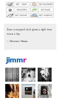 Six visually similar “pixel” icons are placed together in a tight grouping, all linking to external sites. A standalone quote in a separate box comes next. Finally, a selection of Steiner’s Flickr photos complete the selection, all contained in identically-sized thumbnails.
The pupil will instantly understand the principle(s) behind the grouping, making it that much easier for them to bridge the gap with the “how” of creating this by code.
Gestalt Principle: Figure-Ground
The “figure-ground” principle has everything to do with how objects are displayed against a background. Your junior web designer may have an excellent grasp of layering objects atop one another in Photoshop, but it’s an entirely different thing to do it by coding for the browser.
We know they’ll have to learn the concepts of positioning and floats, among other things. They’ll also need to understand stacking order of nested elements and inheritance of style rules. You might consider showing your newbie a site that does a wondrously good job of “layering” objects one on top of the other, such as the design portfolio of my friend, talented web designer, Maleika Esther Attawel:  Seatwork for the newbie: count how many images Maleika uses in her design, and figure out how she positions them to ride atop and alongside one another.
Advanced lesson: have the newbie (or even you, Maleika is very skilled) figure out how she manages to preserve this design in a 100% fluid layout.
Gestalt Principle: Symmetry
Another concept that is obvious to almost everyone, yet not always easy to pull off when coding a web layout is symmetry. I doubt you’ll need to go through this with your newbie, especially if he has a grasp of basic graphic design concepts. Instead, you might want to use some grid-based designs as examples.
In the article, Shannon Noack provides a number of grid-based, and therefore quite symmetrical, designs. One of the most striking examples in the article is a screenshot of digital artist Anton Peck’s website: 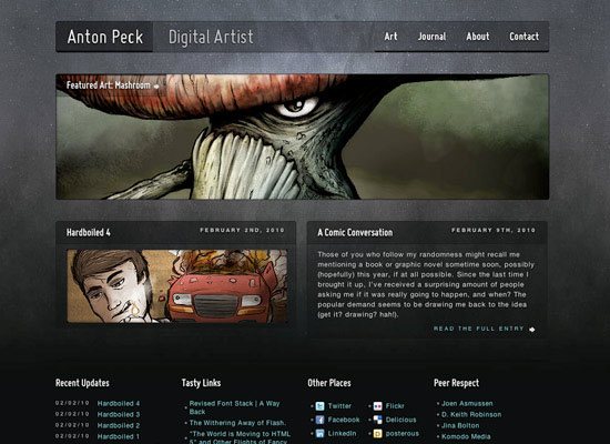 Your student probably won’t have any trouble seeing how vertically and horizontally symmetrical the various elements in Peck’s design are; positioning them in the various layout sections is a bit trickier, but understanding the underlying concept will take the newbie coder a good distance towards that goal.
Conclusion
Naturally, the concepts in this article do not apply to everyone reading it.
Some of you will never have to teach anyone to code a web page, either because you’ll never be called upon to do so (maybe you’re a solo freelancer), or you just wouldn’t care to get involved in such an undertaking. But many web designers, and especially those that work in a company, will eventually find themselves in the position of having to mentor new hires. The next time you find yourself in the situation of having to teach code to a new hire, or your Uncle Elroy, or the ladies at the church, try keeping in mind the concept of kinesthetic learning and gestalism.
I look forward to your thoughts, questions, and tips in the comments.
Related Content
-
 President of WebFX. Bill has over 25 years of experience in the Internet marketing industry specializing in SEO, UX, information architecture, marketing automation and more. William’s background in scientific computing and education from Shippensburg and MIT provided the foundation for MarketingCloudFX and other key research and development projects at WebFX.
 -

WebFX is a full-service marketing agency with 1,100+ client reviews and a 4.9-star rating on Clutch! Find out how our expert team and revenue-accelerating tech can drive results for you! Learn more
Make estimating web design costs easy
Website design costs can be tricky to nail down. Get an instant estimate for a custom web design with our free website design cost calculator!
Try Our Free Web Design Cost Calculator
Share this article


Web Design Calculator
Use our free tool to get a free, instant quote in under 60 seconds.
View Web Design CalculatorMake estimating web design costs easy
Website design costs can be tricky to nail down. Get an instant estimate for a custom web design with our free website design cost calculator!
Try Our Free Web Design Cost Calculator


